Monday, November 1, 2010
Day 1 living the dream
First day interning for ELLE magazine done! yay.. It looks a bit like in the movies so its the coolest :) Cant wait to learn new things, so I'm looking forward to being there all month. Off to bed, tomorrow's gonna be another goodie :)
Sunday, October 31, 2010
D.Rust Extra Virgin Olive Oil

Create an identity for a new olive oil brand, which will be entered into the South African market, as well as to design a range of olive oil bottles and a corporate identity for the brand.
We decided to call the brand of olive oil D.Rust, originating from the area De Rust, Oudtshoorn. We established the olive oil in the market as a ‘culinary masterpiece’. This would be achieved by getting various famous South African artists to design a bottle for the Directors Reserve olive oil each season/ harvest. The designer olive oil would be sold in boutique deli’s and at art galleries, and used in exclusive restaurants. There are two ranges available, the Directors Reserve and another mass market olive oil (which is the non-designer), and will be sold in supermarkets.
Group Members
Nicole Christos
Storm Areington
Justin Mc Millan
Ayrton Portolan
Khyle Strydom
Kelly Haupt


Publication

Required to INTERPRET THE NUMBER 100, and the design should reflect the significance of the number 100.
I chose the 100 brief with the main focus of inspiration coming from Numerology. Using knowledge about the study of numbers, I broke up ‘100’ into 1+0+0=1, leaving the number 1 as my centre of attention. In numerology there is something called your Life Path number and this is calculated by adding the numbers in your date of birth. Numbers will be between 1 and 9, each number has a description of the person you are/ should be, and it gives clues to your character. My focus is on the meaning of number 1 giving instructions and information on how you should be as a person. My target market is aimed at people in the 30’s - mid 40’s, people who read books for self-fulfillment and guidance. The content is educational, fun and interactive with the user. The tear off cards is a way for a person to keep the notes they make and put them somewhere that they will be able to see everyday. It could be extended into a series of 9 booklets as to cater for everyone and not just people with the number 1. The booklet speaks to the user on a personal level as for example a horoscope would.


Packaging Design

Create PACKAGING FOR QUAKER’S NEW ‘CHILLED CREAMY OATS’ (English brand), product for young women looking for a truly delicious healthy snack.
There were four flavours set in the brief, in which I went forward and researched their properties, e.g. Apples are good for weight loss, Cinnamon was shown to lower cholesterol levels, Raspberries/ berries are good at boosting the immune system and lastly Syrup is good for detoxifying. (See Golden Syrup. Maple syrup diet).
Using this, my concept came to be. I used black and white photography to combine the image of the flavour with its purpose. I went for a clean look but although it has a fun feel, it still depicts the healthy aspect that I wanted to get across. It is a simple but eye-catching design that moves away from the usual fruity designs we would see on the shelf.


Joint Aid Management (JAM) - NGO

Our creative team decided to scrap the Red Bowl Day idea and look in other exciting directions. The creative concept sums up in 3 short words, Just add JAM. We took the term JAM literally and teamed up with Black Cat Peanut Butter and combined the two. By adding ‘JAM’ it makes life that much sweeter. The product we created contained swirls of Jam combined with peanut butter to form sweetness in a jar. A person would then have to buy a jar of Peanut Butter and JAM and Re from that purchase goes to JAM South Africa.
The primary target market consisted of ‘The Nurturer’ i.e. any caretaker- moms, dads, grans. And the secondary market being the ’Preteens’. The product also related more to the kids than anything else. The ‘Just add JAM’ logo was helped made out of actual peanut butter and jam.
Maxine Tromp
Samantha Du Preez
Simon Fabricius
Angie fletcher
Sithembiso Motha
Vennduke Chigumba

Creative

Open Brief
An identity of myself in the form of a jacket, inspired by a patchwork theme to show the various assumptions people have made about me.
My initial focus was that of this idea that we as people have some sort of common act of behavior and this is watching other people. From research I found that there seems to be insecurities among people and so I started thinking about all the things people have said about me when they first saw me. This then led me back to my own experiences and personal life. Influenced by two artists; Karen Boutte for her patch-jackets and Rita Barnard for her Patchwork Quilt.
All imagery and objects were sown onto the jacket, which in turn represent me.


Corporate Identity

Develop an innovative, effective and responsible identity program for a real of fictitious company or entity that will play a role in hospitality for 2010 and beyond.
Is there a way to make traffic a little more pleasurable? Introducing Hoot for snacks, a company that provides all sorts of snacks at the sound of your hooter.
This is a local inspiration because in SA we call a traffic light a robot and we have ‘hooters’ not ‘horns’. The idea for this is that when you stop at a robot and hoot, you will be introduced to a variety of sweets, chocolates, cool drinks, crisps and cigarettes. The target market is people who drive in cars and are subjected to traffic on a daily basis, 18-55 years.
An extension from the logo- I have created a few extra little robot men in the colours of a robot i.e. Orange and green, where’s as the logo is red. Together they add to the fun identity of the brand.

 |
| Logo and Extentions |

Illustration poster

To create a poster for a nonexisting band with the main medium being ink.
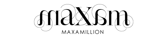
Maxamillionaire
The band name I created was taken from my name, Max. My imagery was inspired by a picture taken of Marilyn Monroe which I then twisted and re-styled into a punk rock look. Repetition of imagery was created in Photoshop which I think added a nice finish. This was done on paper using black ink and a pink pen.


Publication

To create a publication under the title 10 THINGS YOU SHOULD KNOW ABOUT...
using one of ten categories.
My choice of category was Hobbies, namely cupcake baking. My idea was to compare women to cupcakes. Through research, I read up on how women in the past were expected to be ‘perfect housewives’ and there were certain rules they had to follow.
Although, I didn't really focus on the details but more on the imagery of these women. It reminded me of pin-ups as well as retro-style pictures of women baking and that is where my concept began. In this publication booklet I created two recipes; one for the ‘perfect woman’ and the other for the perfect cupcake. Included are poems, rhymes, and decor that address both women and cupcakes. My paper stock also helped bring through my concept, as I used matte laminating which gave it that waxy feel of baking, as well as I have placed sheets of wax paper between each page for effect.
 |
| Front Cover |


 |
Packaging |
Subscribe to:
Posts (Atom)